This blog will act as a learning log for the "Art of Photography" course which I'm studying. This course is the introductory module for the Open College of the Arts (OCA), Photography Degree course.

Tuesday 25 September 2012

Monika Merva

After some reflection I decided that I needed to make more effort to talk about some different types of photographs. I think I often end up talking about photographs that I find it most easy to talk about and sometimes there are photographs that I like, but don't make such an obvious connection to, so don't comment on.

The work of Monika Merva (I came across it in Hotshoe August-September 2012 iPad edition), falls into this catregory for me. So, I'm going to push myself to talk about it.... I figure if I do this more often I may be able to expand my appreciation somewhat.

The photographs here are taken from Merva's "Origins of an Emotion" series (http://www.monikamerva.com). They are of her family and objects and scenes relating to her family. They have an obvious and deliberate personal and emotional feel, but the emotion is still and understated. There is often nothing obvious to tie the emotion to - i.e. no stated tragedy (with the possible exception of the dead rabbit, but even then there is emotive quality beyond that of the dead pet).

For example in the below image, there is a very "lived in" quality to the scene. The light is cool and natural. I get the impression (and hope), that the scene occurred naturally, but drew the photographer to capture it. Probably for reasons they couldn't explain - like I can't really explain why I find it emotive. For this reason it's compelling beyond what a still-life might usually be.

On a design point, there is interesting use of curves intersected by the small diagonals of the knives.


Again, the light is wonderful in the next shot.As are the colours.Probably less obviously emotive, but it still has weight to it. Maybe it's the light and sense of coolness, of stillness that does it.

Nice interplay of diagonal lines again.


The emotional charge of this next shot is far more obvious. The focus is on the hand. The skin is strangely waxy. Why has the face not been focussed on. The arm is also in the a curious position, I find it unrelaxed in it's relation to the body. The colour above the arm is also dark and dense. I almost don't want to say it, but there is a clear sense of oncoming death and loss.


It's the still nature of the body and the down turned head that make the below image emotive. In relation to the current design focus of the course, there is subtle (but clever), use of diagonals and curves in the below shot.


Monday 24 September 2012

Marcel Pedragosa

Found Marcel Pedragosa on Lens Culture (http://www.lensculture.com/pedragosa.html?thisPic=1). I was first drawn to his work as he concentrated on Paris and trying to capture something fresh rather the usual sights. In practice this has meant taking shots which could have been of any metropolitan city (I think this was intentional). That said there is a real sense of the Parisian underground that he's captured.

An interesting aspect is how he took blurred shots in order to circumvent French law which states that you can't publish photographs of people without their permission. This gives the photographs a definitive quality and feel - it adds to the atmosphere, sense of movement, hustle and bustle.

At first I wasn't sure whether they were just pointlessly blurry and a bit lazy for that (i.e. just a cheap trick to make the shots seem more arty), however continued viewing made the images take on more interesting and enduring qualities.

In addition, the blurred quality actual puts focus on the main graphical elements of the pictures (because the detail is lost). This highlights the main design elements (diagonal etc) - see comments below


 The shots capture atmosphere and movement.


This man really stands out from the crowd which surrounds him. He's heavily blurred, but still has real character.


The graphical design elements of this shot really starts to come out. The B&W helps with this.


The diagonal line dominates by going all the way through the shot.


Strong vertical line in the below photograph - complimented by subtle diagonals.


There is an interesting set of curves in the below shot.


Diane Arbus / Susan Sontag

I'm reading On Photography by Susan Sontag  at the minute (see Bibliography), and one of her chapters focuses on Diane Arbus. Arbus is another photographer that I keep coming across, but I haven't really been drawn to her photography and the way it's described so far. However I thought I should spend some more time looking at her photographs.

In comparison with the way in which Sontag describes the pictures I was struck by how tame they were. Maybe it just shows how influential her work is that in the past 30 years these image and the focus of photography on "the other"' on the edge, the periphery, the abnormal, the taboo, the obscene, has meant that these images of Arbus no longer shock like they perhaps once did.

Either way, the images (and those that now follow the same vein), are largely uninteresting to me. I'm far more interested in images which capture the norm (and probably not that interested in portraiture to be honest).

I found an interesting quote from Arbus where she describes how she takes photos as an excuse to get near to people who intrigue her. Again, I found this interesting, as it differs greatly from why I'm interested in photography - not as a means to get access to something which would otherwise be unavailable, but as a way to see what I already know in as tangible a way as possible, or to see it in a different light, as I've never noticed it before.

Sunday 23 September 2012

Part 2 - Exercise 5

Project - Lines

Exercise - Curves

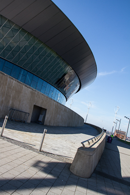
I took a number of shots for Curves, I've chosen my favourite 4 (directly below), and then added the remainder beneath.

The curve in "curve 1" leads the eye up from the bottom of the frame. The eye quite literally follows the path.. The dark roof helps to bring the eye back round into the frame. (I think perspective also helps direct the eye into the depth of the centre).
curve 1
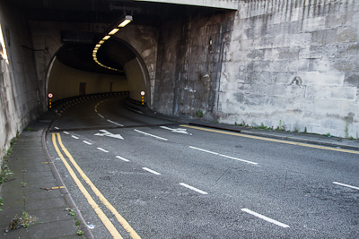
"curve 2" has another path/road, but this time the eye starts under the tunnel and feeds down and out by following the curve of the road.

curve 2
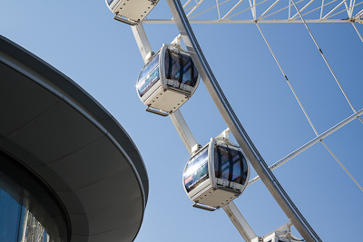
In the below shot the 2 curves oppose each other. This stops the composition being unbalanced. The 2 curves also contrast nicely with the boxiness of the frame.
curve 3
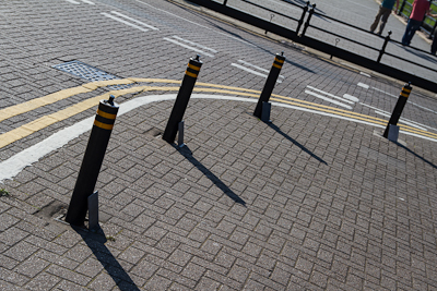
In "curve 4" the dominant curve is actually implied between the 4 bollards (obviously the curve of the road markings helps). The straight lines of the slabs, other road markings and also the diagonal shadows help to add interest and again, keep the image balanced.
curve 4

Other curve shots


The boat created a great curved wake in this river, but I didn't have enough height to really show it.


There's not much balance or connectedness between the 2 curves below.


The swooping curve below helps to lead the eye to the figure and frame it within some nice movement.


I figured there was a curve of legs in this one


All the shots I'd taken were of man-made curves - other than this one.


Later Parts

Part of this course is very well aligned to my current areas of interest in photography. The photographs that I'm really drawn to are often really good examples of the techniques layed out in this part. The Assignment should also provide me with some good opportunities to explore this - Street Detail...

However, if I look forward to the later Parts I'm less confident. Part 4 is all about light, which is fine, but the assignment requires focussing on a single subject (which you can walk all the way around). I'm thinking that a lot of this part will naturally tend towards still life (which I'm not overly interested in), so I'll need to use my imagination to work within the constraints and still do something I'm excited by.

Part 3 is on colour, which I'm pretty useless with.

Part 5 relates to narrative, it looks pretty tricky and not something I feel as aware of or inspired by.

But I guess that's the point, to try and tackle the things I'm not so good on and get better at them. Up to now, I've been challenged but largely within my comfort zone, looks like the course will soon get a lot harder than it has been up to this point. Which is good, but intimidating.

Marten Lange

I was reading the iPad Winter 2011 edition of the British Journal of Photography and saw some of the work of Marten Lange (http://martenlange.com).

Lange works in Sweden and initially through necessity he had to use flash due to the long periods of short days and long nights. However he was also fascinated by the unusual, unfamiliar and sculptural look that this gave the subjects. He's made no attempt to make the flash cast a natural light, but instead used this unnatural, cut-out quality as a key characteristic of his work. The photographs contain no sign of being a lived in environment, they could be official records of an evacuated town, taken years after the event.

The below shot is mainly black and white with limited mid-tone. It's the shape of the house and the slope of the road which dominates. Good example of the combined use of diagonal, triangle, horizontal and curve.


Difficult to see the below shot against the white background. Good example of a single point.


More triangles and diagonal lines below. It's the light and contrast which makes this interesting, but the compositional aspects which keep the eye moving round the shot.


Diagonal lines with a wonderful long meandering curve (or set of curves), which adds interest and movement. But the jumbled curves are literally pinned in place by the diagonals.


Another wonderful curve and then vertical line.


I've shot these myself (for the "curved" contrast type for Assignment 1), but with the cold, harsh lighting and unnatural shadow it looks completely different and more alien.


The box below sits perfectly in the frame. It's a diagonal lines nice offsetting the frame itself, but perfectly proportioned with it (the box is too big to be considered a point). The texture of the cardboard also contrast subtly with that of the ground.


Another wonderful curve.


The next shot is from a series on crows. I've never seen a photo like this before. The foliage has a wonderful consistency to it, with very little contrast. This in turn sets off the very small, but highly contrasting crow. Great example of a point, but one which work s well in the centre of the frame (if it was anywhere else we may not spot it!), probably because the frame is square.


The below is from a series on the sea. Another good example of a point which is unusually small. And a horizontal which nearly halves the frame. Not sure why this works, but I really like it.


Saturday 22 September 2012

Part 2 - Exercise 4

Project - Lines

Exercise - Diagonals

[just finished read over this and realised that while I was pleased with myself for doing more than 4 photographs, the important thing might be to have edited them down to 4.... I'll make sure I do this next time.]

diagonal 1
"diagonal 1" contains a number of varying diagonal lines, perspective is only part of the equation here.

diagonal 2
"diagonal 2" is all about perspective. "diagonal 3" is perspective again, but upward rather than forward.

diagonal 3
diagonal 4
Shadows cause the diagonals in "diagonal 4".

diagonal 5
Another perspective shot.

diagonal 6
"diagonal 6" contains perspective, shadows, tilted camera and the genuine diagonals of the staircase.

diagonal 7
Another perspective shot.

diagonal 8
Another shadow.

The following shots all contain the same staircase (the elevator goes underneath it), but also use perspective (and wideangle lens), to emphasise the angles.
diagonal 9
diagonal 10
diagonal 11
diagonal 12
diagonal 13
In "diagonal 13" the pattern is already diagonal, but the perspective compresses the pattern which then emphasises the diagonals.

The below shots are of diagonal shaped buildings, but again the wideangle and perspective adds to the diagonals.
diagonal 14
diagonal 15