This blog will act as a learning log for the "Art of Photography" course which I'm studying. This course is the introductory module for the Open College of the Arts (OCA), Photography Degree course.

Showing posts with label Part 4. Show all posts

Sunday, 22 December 2013

RayKo - The Best from Photographers with Plastic Cameras and Film

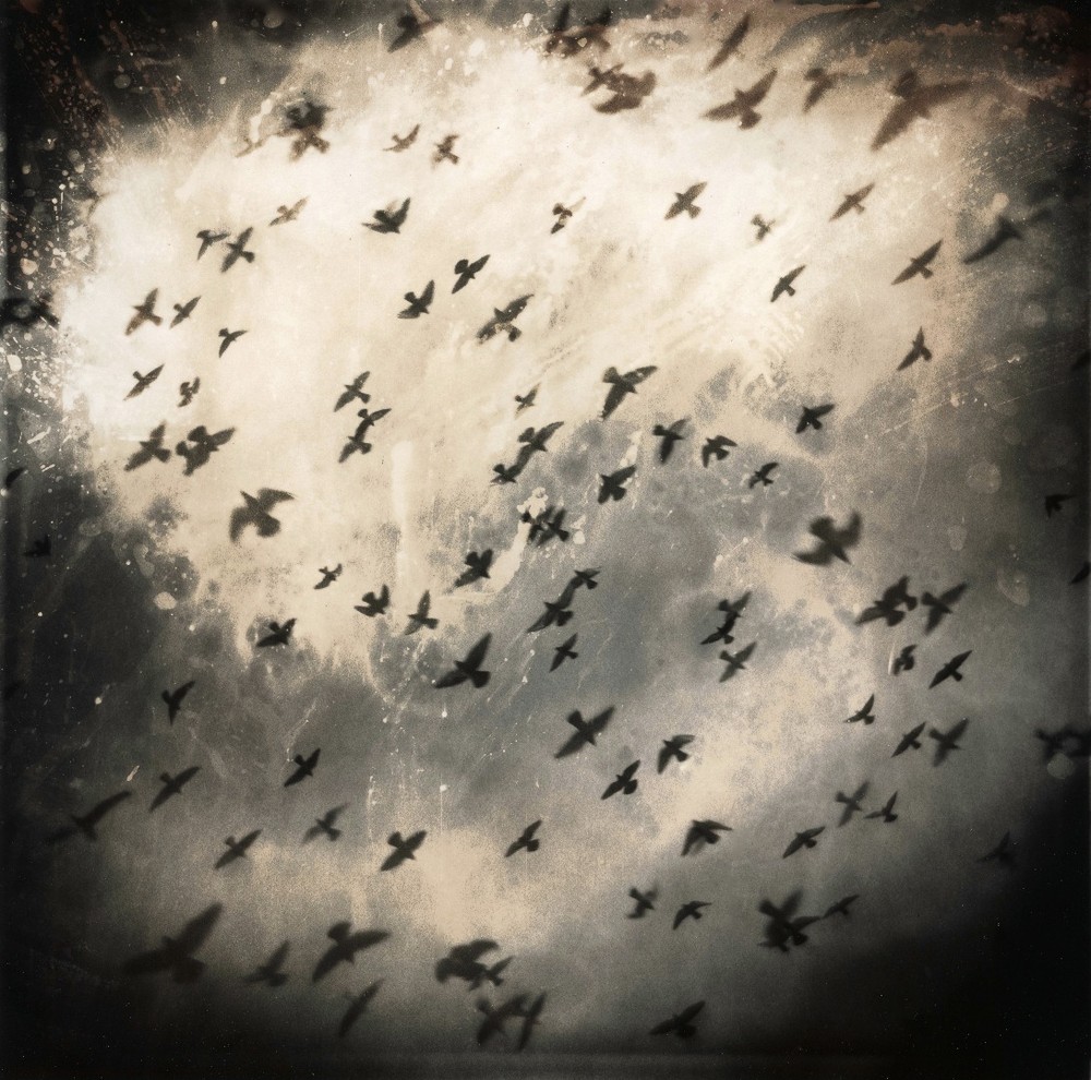
Every year Rayko hold a competition for photographs taken with basic plastic cameras (https://www.lensculture.com/articles/rayko-the-best-from-photographers-with-plastic-cameras-and-film). The entries have an unsurprisingly low-fi feel which brings a consistent appeal to the entries. The photographer would have had to leave a lot to chance, unsure of what the resulting photograph would be and unable to apply changes in the processing stage - this is clearly part of the appeal. It gives the photographs a magical and fundamental quality, an originality which would be lacking if we knew that the work was digitally manipulated.

I've been attracted to the idea of doing some "lomo" photography for a while, but worried that it was too gimmicky and the seeming offer of high integrity was itself false. However, this work inspires me that it would be worth taking a more lo-fi approach and leaving part of the outcome to chance.


Martin Bogren

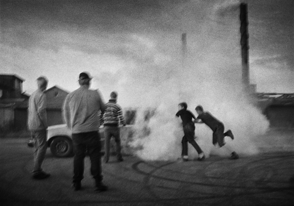
I've seen Bogren's series "Tractor Boys" previously, possibly in British Journal of Photography, I was intrigued but I didn't comment in the blog because I just put the work into the category of reportage which didn't really interest me. However, I now see the work in a different light and I'm more aware of why I find the work intriguing (https://www.lensculture.com/articles/martin-bogren-tractor-boys).

The subject matter is that of young men in Sweden who spend their time racing their cars against each other. However, the work has more drama and character than would normally be found in documentary photography. The photographer is adding an additional layer of artistic interpretation here and it is in the combination of the interest of the subject and how this is used and built upon by the artist that the unique character of these photographs is derived.

There is a narrative here, which at least in part is derived by the contrast (juxtaposition), of the raw and macho nature of the subject and the sensitive and poetic nature of the resulting photographs.


Sunday, 15 December 2013

Magnum (lighting)

A few images which show an interesting use of light in the Magnum book I got for my birthday.

Harry Gruyaert's photograph from inside a room in Mali. The scene has high contrast with the bright light outside showing through the window in the scene outside and also the light shining through from the window to the side (pg 296). The image has wonderful warm tones.

The sunlight through the shutters create a myriad of patterns in Gueorgui Pinkhassov's image of Japanese business men. Combined with the out of focus shapes of the men, the image takes on a beautiful abstract quality (pg 387).

The backlighting in the image of the forest canopy in Stuart Franklin's photograph creates a wonderful silhouette pattern of pure black and white (pg 508).

I was suprised to see that Bruce Gilden was part of Magnum. His approach to photography which subjugates and almost humiliates the subject seems quite counter to the humanitarian ethic of Magnum - at least in terms of approach, if not output. However, the results are powerful, striking and unique. The literally "in-your-face" flash bleaches out and freezes the subject and leaves the background darkened and blurred. The expressions on the faces of the subjects range from the shocked, to the confused, to the defiant. (pg 484).

Assignment 4 - conclusion

I've now submitted Assignment 4 to my tutor, I've captured my reflections within the submission, so I won't add much more here other than 2 say that I enjoyed Part 4 and I'm looking forward to completing Part 5 and then moving on to the next course!

My full submission for Assignment 4 can be downloaded here - https://dl.dropboxusercontent.com/u/104013160/Assignment%204%20-%20Steven%20Briggs%20-%20510812.zip

Tuesday, 19 November 2013

Bas Princens

Bas Princen's work is very intriguing (http://www.oftheafternoon.com/bas-princens-images-of-vast-structures-and-spaces/). His photography captures the interplay of the natrual andman-made environment with a centre point of buildings and the construction and destruction process of buildings. There is something fantastical about the images, but also very matter of fact. In truth, i'm unclear as to whether the images contain any manipulation of reality or just a very specific perspective of it. Size, scale and even time and place are often difficult to grasp here. The images often have a flatness as a result of little, or at least very constrained/restrained shadow - I think this increases the sense of dislocation from context and place.

There is something of the Dusseldorf school here, but also something more playful.

20130808-113251.jpg

20130808-113300.jpg

20130808-113318.jpg

20130808-113329.jpg

Alex Prager

I bought the November 2013 copy of British Journal of Photography at the weekend. Probably the most interesting work (to my current taste), was by Alex Prager. Prager's work is highly stylized, cinematic and reminiscent of 50's Amerciana. Some (but not all) of the work is of a grand production scale, costumes are carefully chosen, people in the work are considered characters, lighting is very deliberate, perspective, focus and composition are highly controlled. There is an element of humour, but also a under the skin darkness and anomie. Overall the images are exquisite to look at.


Thursday, 14 November 2013

Ruben Brulat

Robin Brulat takes photographs of the natural and man-made environment in which he situates himself, naked, small and almost hidden in the frame (http://www.oftheafternoon.com/self-portraits-from-ruben-brulat/). I think this interests him as a way of engaging and representing engagement with nature.

The images have a not quite instant appeal. At first when you see them they look like, distant, cool almost inhuman landscapes and cityscapes, and then you see a naked body and your head spins for a second as the image takes on new layers of significance and meaning.

The images have a stillness to them. The perspective is also quite flattened. The lighting is also quite straight on, though often other lightsources exist within the frame also.

20130801-114810.jpg

20130801-114757.jpg

20130801-114815.jpg

Sunday, 10 November 2013

Exercises, Learning and Technology

As I approach the end of this part of the course I was re-reading the course notes and looking through some of the exercises I've done on light.

I'm aware that I've rushed some of the exercises and even skipped certain sections of them. In each case I did this where I felt that I got nothing more to learn by doing the exercise. I genuinely don't mean this in an arrogant way, it's just that I feel that I know what I need to know about ISO settings and the effects of increasing/decreasing exposure.

Having said that I was struck when re-reading the course notes that I probably still don't make a conscious decision (in the way proposed in the notest), re exposure or white balance settings. However, when shooting RAW I know that I can comfortably alter these settings after on the computer. But this of course raises the question of whether this is lazy/cheating/ignorant etc. And also whether by not potentially having the experience in doing things fully manually in a fully committed way the photography will in some way be inferior.

I learnt a lot of my skills as a photographer shooting 35mm film in an SLR about 30 years ago. However, it's significantly easier to experiment, practice and therefore learn and understand in a digital environment. What I mean by this is that previously, when shooting film I understood that tungsten lighting would produce a horrible orange cast over my photos unless I used a blue filter or special film. However, my options here were very limited and if I got those options wrong, I couldn't correct anything. This meant that my creative options were actually very limited. And unless I had a lot of equipment, a lot of time and a lot of film - so in other words I had a lot of money and/or was a professional photographer - I would be very limited in terms of what I could achieve. I could take great photos, but my subject matter would be significantly more limited to what I could do now. So what I concluded here was that the technology was enabling me to be more creative by giving me more options (consistently through time), but that a clear eye as to how to remove the orange colour cast of tungsten lighting (for example), was still very important. In fact the creative aspect of this is even more open because I can do far more than stick a blue filter on the front of my lens and hope for the best.

I also reflected on how artists in DaVinci's time would learn their trade by sourcing materials for and mixing paints. No-one would really recommend an oil painter these days to mix their own paints. But that's not to say that an understanding of how light passes through paints of varying consistencies would be useful.

I guess my point is that I'm comfortable that as long as I have a base, core understanding of white balance (as an example), I'm OK not knowing individual Kelvin values of each light source because advances in technology mean I don't need to. I just need to have the creative eye to know when the white balance needs changing, and how to go about changing it, in order to achieve my required effect.

Saturday, 9 November 2013

Noemie Goudal

And here's another artist who plays around with the photographic frame... Noemie Goudal (http://www.oftheafternoon.com/noemie-goudals-installation-photographs/). Where Goudal differs is that he/she puts the photograph itself into the scene and then rephotographs that as an installation. The original photograph transforms the scene and inturn the final photograph.

island2

haven2

thelovers8

In honesty, in my view the idea here is better than the resulting photograph. However, the installations are probably far more impressive.

Myoung Ho Lee

Myoung Ho Lee kind of does a reverse of the artist in my last post (http://www.oftheafternoon.com/myoung-ho-lee-captures-tranquil-trees/). Again, he inserts a frame into the picture, but this time as an artificial backdrop to his central subject within a landscape, a tree.

image

image

image

Again, I think this encourages reflections on the arbitrariness of the chosen frame which the photographer chooses to put on the landscape and also the arbitrariness of the chosen subject.

Daniel Kukla

Daniel Kukla (http://www.oftheafternoon.com/daniel-kuklas-abstract-mirrored-landscapes/ ) has taken a series of photographs where he's situated a large mirror on an artist's easel in different landscapes and made the reflected landscape part of the picture.

9 (1)

11 (4)

1 (4)

The mirror provides an interesting graphical juxtaposition, but more importantly raise interesting reflections on the artists perspective as well as the arbitrary/constraining nature of the photographic frame.

Sunday, 3 November 2013

Magritte's boots

I was taking some pictures of the boots for my assignment this morning and I was reminded of the painting of boots/feet which Magritte did:


I think one of the reasons why it suddenly struck me was because some of the compositions I've found to work are very similar to this - head on to the background and slightly pointed down to the shoes. And the shoes be closer at the heel and further separated at the toe.

Interesting.

Saturday, 2 November 2013

Brendan Barry

Found Brendan Barry on aCurator - http://www.acurator.com/blog/2013/10/brendan-barry-motels.html . Barry (http://brendanbarry.co.uk/). Has taken a series of photographs of motel rooms. They are inspired by and in-turn invoke the American short-story. They cunjur (spelling?) up a narrative. And so the photographer has joined forces with a writer who is going to write a series of hot stores inspired by his photographs.


The work is interesting from the perspective of Lighting because the dominant source of light in these photographs is the TV. This is evocative both as a source (we can all remember that disorienting feeling of falling asleep with TV on, only to wake later with only it's eery glow lighting the room), but also in terms of how it lights the room with a cool colour cast and and upwards direction.

Brendan_Barry_02.jpg


Brendan_Barry_05.jpg


Brendan_Barry_01.jpg


Brendan_Barry_07.jpg


Tuesday, 29 October 2013

Part 4 - Exercise 14

I'm going to skip this exercise (the course notes do say that the latter lighting exercises are optional), as I think it's really tailored toward studio setup still lifes - which don't really interest me much.

Part 4 - Exercise 13

Concentrating light


I had to make a device for this to create a spotlight effect.


In the above photographs I experimented with the options that being able to focus the light provided - i.e. pointing the light slightly infront of and behind the subject as well as directly at it.

In the shots below I did the same thing but in different settings.


It provides a different set of options to what a non-spot effect would provide,

Sunday, 27 October 2013

Toshio Shibita

Toshio Shibita (https://www.lensculture.com/articles/toshio-shibata-the-constructed-landscape-as-art) is has spent the last 30 years photographing the landscapes of America and Japan - particularly how they have been modified via human interaction and construction. However, rather than being purely documentary he includes image manipulation in his work. They almost have amontage feel to them where perspective and context are lost, but geometry and graphic are emphasized. They are almost constructions of a constructed landscape. They have a certain purity which, for me, imbue a certain aesthetic beauty to their subjects.

I find the mix of documentary and art interesting - particularly because I'm finding straight forward documentary photography increasingly uninspiring.


Sunday, 20 October 2013

Gregory Crewdson - Brief Encounters

I've become increasingly interested in Gregory Crewdson since my last post on him. He's an obvious sourceof inspiration given my desire for upcoming Assignment to have a Tableau aspect to it.

I recently watched a documentary which was done on Crewdson's "Beneath the Roses" series for which he is arguably most famous. The film is called "Brief Encounters".

I was an enjoyable watch. Nothing particularly surprising or revelatory - his work had just the level of production values that I'd expected from what I read.

On a more general note, I found it interesting to re-read my comments on the 2nd chapter of "Photograph as Contemporary Art" which is focussed on Tableau. Overall I was pretty unimpressed at the time - even with Crewdson! I think I'll take another read through the chapter now that I've obviously warmed to this style of photography.

Thursday, 17 October 2013

Boots - the bad and the ugly, not the good

I'm aware that I'm in potentially dangerous territory of "Fine Art" photographs by having boots as my subject matter. So I thought I'd source some suitable reverse-inspiration instances of what-not-to-do. Some of these aren't too bad, but they're all a bit too arty and over processed. I think they also have the boots overly dominating the frame too, so don't have the Tableau context I want them to have.


The lighting here is potentially quite interesting, but the perspective makes the shot too playful.


Nice detail here and the lighting give the shape form too. But it's not what I'm trying to achieve.


Well there's certainly plenty of texture in this overprocessed HDR example. Certainly not what I'm looking to achieve.


I do like the lighting and tones of this photograph. The subject has good depth of form. I do find the composition a bit bland though. There's something the background - if it's relevant lets see more of it, if it's not relevant, lets not be distracted by it at all.

More over processing here.


The lighting here is nicely diffused - subtly showing up the detail in the leather. However, again the composition is all wrong for me - tightly cropped around the boots, but with lots of distracting stuff around it.


Lots of form here. And it's good to see a composition which seems to be making purposeful use of the scene in which the boots are set. But, it's very heavily processed and stylised overall. Looks like something from Athena.


This "on the kerb" shot is somewhat similar to a setting I hand in mind. But for me the perspective doesn't work - too top down and close-in. And what's that flower up to?


Interesting light effect - but quite probably just painted in via photoshop.


The high contrast directional light gives good form. But the central composition and splayed feet looks awkward to me. I like "real" setting though - certainly in comparison to the other photos I've chosen,


This is potentially the closest out of all these photos to what I want to achieve - mainly because I don't want the boots to overly dominate the composition. However, the oldy worldy effect here is a bit tiresome.


This is almost a product shot. Awkward composition.

By the boots being in the shadow detail is lost and shape dominates. Again, I would like to have seen more of the overall scene in which the boots are sitting.

Another overly processed photo. But another scene I was thinking of using - boots on a bench.


I do like the light here - shows all the detail in the boots. Would have liked to see more of the scene (again) - and what's that red for all about?