So, starting Part 3 now. Only a few exercises in this part - they look fairly simple and straight forward, although it may be quite difficult to find some of the subjects which contain the right colour combinations.
However, I think the Assignment will be particularly difficult and will need me to find a number of different subject types - I think I might force myself do some portraits for this one, could do something where people are wearing certain clothes against certain backgrounds. Some still life might also be interesting, but I'd like to do something which is found and unposed. Of course, I'm sure I'll still be able to take some shots of the street.
A key challenge for me overall with this part is that Colour doesn't overly interest me in and of itself - certainly not like Design principles.Hopefully by learning more about colour theory and how this can be used, it will become more interesting to me.
Monday, 31 December 2012
Sunday, 30 December 2012
Andreas Gursky
There is an intense amount of detail and complexity in many of the photographs, but also a dominant sense of order. The photographs are usually from a high vantage point and at some distance
Another Deadpan photographer I wanted to look at further is Andreas Gursky. Quite a lot was said about him in "The Photograph as Contemporary Art", but not much of his work was shown. To be honest I think it must be difficult to get any sense of the work from viewing at the scale which is available on the web, but irrespective you at least get an impression of what these works must be like at full scale.

Some of the photographs include humans and present collective human behaviour or activity. However, no individual is singled out and presented. And it's certainly not clear what, if any, comment Gursky is making about the people or the scene.

Boomoon
It's interesting to see how his work developed from his street photography of the 70's into the Deadpan style which brought him to my attention.
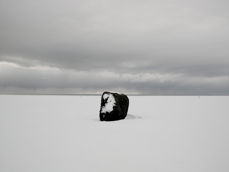
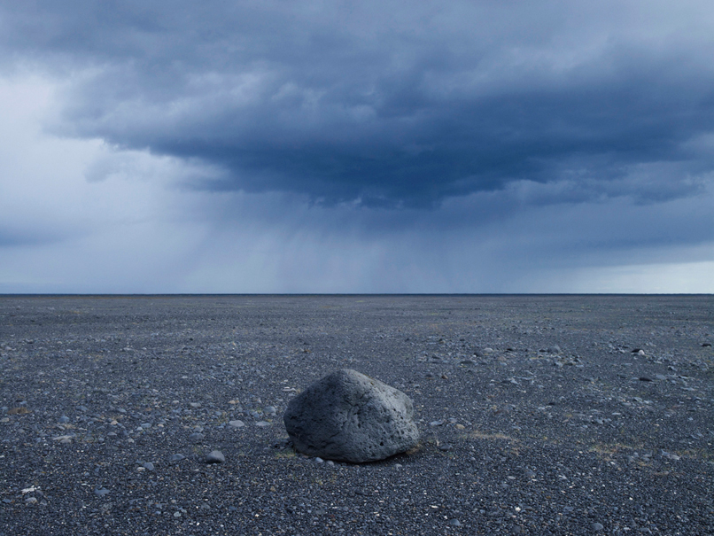
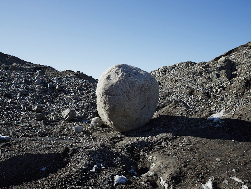
I was most intrigued by his series "To the stones" which are basically photographs of large stones or rocks which he's come across on his travels. He refers to them as portraits. They taken at eye-level in what looks like mid-day light. They are unsentimental to the point of being bold. And interestingly the stones are very much at the centre of the shot - which is what I think the site refers to as "plays with the risk of item-centrism".
In the shot below the stone forms a central point. I think the positioning of the horizon helps to keep the composition interesting (Boomoon treats the positioning of the horizon as a subject in other series - I guess this goes back to the explicit focus on perspective which I read that Struth shows). The snow on the side of the stone and the subtle highlights in the sky also add interest and keep the image gelled together.
The photograph below has a subdued blue tone. The position of the horizon is again important. The cloud provides a nice counterpoint to the stone - it somehow equals it's weight.
In this photograph there are a number of diagonal lines pointing to the centre.
In another series - Naksan 2010 - he photographs the sea with the snow pelting down at 45 degrees. The photographs are decidedly similar in nature. They are neutral in tone and relatively low contrast. They contain no obviously emotive content - just the sea. They're taken in the vertical (another deliberate point to the fact that these are photographs. But the part of the frame below the top square is completely devoid of detail - when viewed on a white web page it looks like part of the page. His website says that snowy shore bonds the viewer to the scene. He then quotes the poet Shino Kuraishi with words which seem to relate very much to the Deadpan aesthetic - "The shore may be a stage but it is entirely anti-theatrical. It has nothing to do with spectacle, of a type that would satisfy the visual desires of the general public. Rather it is as if the stage was built for one beholder alone. These are photographs for a quiet dialogue with oneself." Within the text he refers to the viewer as photographer-beholder. This is photography which narrates on the experience of viewing photographs and in turn the experience of viewing the world (I think?!)

The Photograph as Contemporary Art - Chapter 3
The 3rd Chapter of "The Photograph as Contemporary Art" is als about Deadpan - "a cool, detached and keenly sharp type of photography". I think the key point here ia"detached", as in emotionally detached. This is a move away from emotional engagement with or judgement of the subject. While some of the subjects may be emotive, the photographer is ostensibly recording rather than commenting. The emphasis is on the objective rather than the subjective. Photography is therefore seen as a means to obtain an objective standpoint as opposed to presenting a singular vision - i.e. that of the photographer.
Another important aspect here (and also relates to a word in the definition which opened this entry with), is sharpness. Many of these photographs are intended to be displayed at significant scale. They're taken with large format cameras to increase the level of detail that can be captured and displayed.
There is often an element of removal of the human in Deadpan, Dan Holdsworth took photographs of build landscapes such as shopping centres, but at night and with long exposures - "The image has a distinctly non-human atmosphere, as if showing us an essence that could not be seen by the naked eye. Rather than asking who took this photograph, one might reasonably ask what took it, the sense being that the unsettling contamination of the night is being recorded mechanically, by a surveillance camera perhaps."
Boo Moon took photographs of the East China Sea. Again his work is out of time and without human involvement, they are without history.
An artist that I found particularly interesting in this chapter was Thomas Struth. In his photographs there is an awareness of the photographic form in his work. We are encouraged to take interest in the perspectives and how they are captured in the photograph. To me this seems to be moving away from the sense that the photograph is objective? Surely any thing which has a perspective is not objective?
Struth is also keen to capture the human. He's taken a series of photographs of people viewing art in galleries. They capture (but don't comment on?) this aspect of human behaviour.
Thomas Ruff also includes people in his photographs but again in an unemotive way. He took a series of photographs over the course of a number of years of head and should shots of his friends. They're effectively very high quality passport photographs which "confound our expectations of discovering a person's character through their appearance". He displays on a large scale so that great detail is shown (down to the pores in the skin).
Elsewhere in the chapter we see other photographers who take photographs of people in context of natural surroundings with a neutral, eye-level perspective and flat expressions form the subjects which present limited insight into their lives and personalities.
Overall the Deadpan style is quite interesting to me. I think Gursky, Moon, Struth and Ruff are artists I'll do some more research on.
Amend
After doing some further reading I realised that I'd missed that Deadpan is sometime used to describe what should be the norm as an approach for documentary photography. Which makes sense.
Sunday, 23 December 2012
Assignment 2 - Reflections
As I did with the first Assignment I wanted to write down my reflections now that I've completed the submission.
As last time, I'm reasonably happy with the photographs I've taken. Despite some of my initial concerns that I lacked any real structure to the way I approached the shoot, I think the photographs work as a set but equally are quite diverse.
Demonstration of Technical and Visual Skills
I think I've successfully displayed applications of all the design principals. And I've donee so without shooting the obvious. I think a number of my shots demonstrate more than one principal but are "good" photographs rather than just being demonstrations of a principal.
And I don't think any of my shots have the technical shortcomings that were present in my first Assignment. I also refrained from over processing in Lightroom which is a mistake I made last time.
I guess my only shortcoming here was that display any movement in any of my photographs - they're predominantly quite flat, but maybe that was a direct result of my chosen subject matter.
Quality of outcome
I think I've followed the presentation structure recommended by my tutor with consistency and clarity. I've also added Sketches to help explain my thinking behind each composition (although I'm not sure that even with some of the sketches my thinking is overly clear - I'll see if I get any feedback on this). So fairly comfortable with this.
Demonstration of Creativity
I don't think I've taken any photographs which show a massive amount of creativity or originality, but I think there is some ingenuity and imagination in there. As above, I think there is diversity but also consistency - which I'm quite pleased with.
Context
Again, I think my write-up is fairly complete as is my blog. So reasonably comfortable with this.
So, I'm looking forward to getting my feedback and cracking on with the rest of the course!
Sunday, 16 December 2012
Redeye future events
Couple of future events I'd like to attend which Redeye are pulling together - talks by 2 artists I've come across in the book I'm reading at the minute Richard Billingham (10/1/13) and Peter Fraser (17/1/13). It'll be great to hear in more detail from a respected artist. Hope I can attend....
Redeye Slide Jam - Liverpool
I was pretty lucky in being able to combine my day wandering the streets of Liverpool taking photos for Assignment 2 with going to the Redeye (http://www.redeye.org.uk/) Slide Jam in Liverpool's Open Eye gallery (http://www.openeye.org.uk/).
I went to the gallery during the day as I wasn't sure I'd be able to view the installations during the evening. I was particularly interested in the work on Fan Shi Shan and his Two of Us project (http://fanshisan.com/index.php?/project/two-of-us/). I've come across it somewhere previously, but it was great to see the work at such a large size where the subtlety of the colours and the stillness of the compositions really came across.
In terms of the slide jam, it was a great evening surrounded by people with a great interest in photography. Some of the photography was more interesting than others all of them filled their 5 minute slots with enough interest to make me want more. I'm listing them all hear so that I can take a closer look:
Mark Peachey
Chris Mear
Yan Preston
Alan Moore
Paul Smith
Simon Hall
Alison McLean
Colin McPherson
Kevin Casey
Fran Martinez
Gavin McQuarrie
Tony Mallon
Phil Portus
Sharon Boothroyd
It certainly made me walk away thinking that this is something I would like to display my work in at some point further down the line.
Assignment 2 - post shoot reflections
I've finished taking all the photographs I need for Assignment 2. It consisted of a morning in Crewe, a day in Stoke-On-Trent and a day in Liverpool. Basically I just wandered the streets looking for inspiration - which I found in abundance, particularly when on the outskirts of the inner-town, where things were a little less polished and populated.
At first (in Crewe), I mainly found verticals and horizontals and really struggled with points and patterns, though this changed as I moved on to Stoke and Liverpool. I also split the day in these latter locations between day and night.
I managed to stick to all of my original intentions - http://stevenbriggs7.blogspot.co.uk/2012/12/assignment-2-preparatory-thoughts.html .
I've got all the photographs in Lightroom and I've got my initial selected shots which I'm now continuing to review - making sure I've chosen the right images and covered all the requirements of the brief. However, so far I'm quite pleased with the photographs I've produced. I think I need a week or so to pull the assignment submission together.
Sunday, 9 December 2012
Assignment 2 - preparatory thoughts
Preparing for Assignment 2 has been very different to preparing for Assignment 1. For the first Assignment I spent a lot of time looking at the brief and coming up with ideas of what to shoot before taking the first picture. Given that the subject for the second Assignment is street details and the requirements are abstract design principles I've not been able to develop any ideas based on shooting a specific subject. Instead I'm just having a few sessions of walking the streets with the brief in my hand and looking for inspiration.
I've had one session so far, wandering round the backstreets of Crewe. I created some images that met parts of the brief, but I think I just captured the easy ones that most fit my preferred style - lots of verticals and horizontals. So I'm taking to to the streets of Stoke-on-Trent tomorrow and I need to be more mindful of points, triangles, patterns and rhythms.
I'm back to Liverpool on Tuesday. Again I'll be focussing on the back streets.
Actually there are a couple of constraints that I'm putting on myself rather than just walking out blindly.
1) I'm going to avoid including people in the pictures unless they're explicitly part of the design. I want to do this on the basis that people will always draw attention and cause distraction from the design.
2) I also intend shooting in colour. My original thought with this Assignment was that I would shoot in B&W but somehow this felt a bit flat and also contrived when I looked at my first shots for the exercises.
3) I'm going to use a prime lens with a full frame equivalent focal length of 55mm. I think this will help give all the shots a consistent feel and as a standard focal length lens it create a natural, "normal" feel to the shots. In addition, it will force me to approach the subject and work hard to get the right composition as opposed to lazily using the zoom.
4) The nights have "drawn in" and I've noticed how the fluorescent street lighting has an interesting effect of reducing the variation of colour and tone and so making things seem a little more graphical and geometric in nature. I want to see if I can capture and use this in some of the shots for this assignment.
5) I intend to spend far less time processing the photographs in Lightroom. I think I over processed some of the shots in my first Assignment (though I was doing a lot less processing that I used to do on my shots before I began the course!), and so will be trying to shoot in jpegs in order to limit myself and encourage me to get it right in camera.
6) I want to try and take inspiration from the photographers I've been inspired by up to this point. The ones which seem most relevant are Lewis Baltz, Lee Friedlander, William Eggleston, Inaki Bergera, Tina Hillier, Bob O'Connor, Marten Lange, Orjan Henriksson (all of whom I've written about in this blog).
Thursday, 22 November 2012
The Photograph as Contemporary Art - Chapter 2
Chapter 2 focusses on artists who tell stories with their photographs. Either as retellings of pre-existing stories, or artwork or more open ended narratives. This type of photography is also referred to as 'tableau'.
Philip-Lorca diCorcia appears in this chapter also for his work where he essentially creates scenes or stories for real life characters he works with.
In many instances the photographs involve significant setup and involvement from large teams of people. Gregory Crewdson would appear to be one of the most extreme examples of this, with highly complex, elaborate and extremely engaging and engrossing sets.
However, there are notable exceptions to this. Christopher Stewart shot a series which appear to be staged but aren't setup at all. As such I don't really get why his work is included in this chapter? Interestingly, his shot included in the chapter is probably my favourite of the chapter....
The story telling often gives the photographs a fabled aspect and there are common themes at play such as childhood, religion. But these themes are often dealt with in an ironic and/or dark way.
The photographs don't seem as pointless as I found some to be in the first chapter, but I still struggled to find many photographs that really grabbed my attention. However, this may be partly due to the size of the photographs in the book (the technical aspects of presenting the work to the viewer including context, format, surface and size are clearly considerations for the artists), and also the fact that only 1 shot of each photographer is included. I think I need to study some of them a bit more closely to see if I get more from them on closer inspection.
Amend - 24/11
Started trying to read a bit more about Jeff Wall who is quoted as being a major proponent of tableau photography. I came across an article in a series called "Best Shot" in the Guardian (http://www.guardian.co.uk/artanddesign/2010/may/05/photography-jeff-wall-best-shot). It's an interview with Jeff Wall where he talks about his (you guessed it,.... ) best shot.
The photograph to me looks quite unassuming. Candid even. But it was actually planned for over a year. The room was created specifically for it and it was taken at a specific time of year. One of the women in the shot does live in the flat, but only because she was asked to do so by the photographer.
There is not much in the article which would seem to state why Jeff Wall thought the shot was noteworthy, other than that it was evolved through a fairly open ended (but still constructed), creative process. So is the preperation rather than the shot, the point? I'm not sure.
I also tried to find more on Christopher Stewart (it was surprisingly difficult to find much information). The shots I did find all had the same staged feel, even though they actually weren't. However, I guess it depends on what is meant by staged? If the subjects are being themselves, doing what they would be doing even if the photographer was not there, is it staged? But we all behave differently if we know someone is about to take a photograph.
Tom Hunter takes photographs tell (or recreate), stories about the people around him in Hackney. If I understand correctly he wants to imbue the people with a sense of value, beauty, character and even reality which the mainstream press and it's reportage photography was robbing them of. A lot of his work recreates classical scenes in order to help this strategy.
I don't really see how Rut Blees Luxemburg's work fits into the tableau genre. There doesn't seem to be anything particularly constructed here and as the shots are usually without people and often without anything that could be considered a prop, I'm not sure how she fits in. However, her nighttime photography does have a subtle narrative quality to it - but more than that of most other photographers? I'm not sure. Irrespective, I find a number of her shots quite compelling
Wednesday, 21 November 2012
The Photograph as Contemporary Art - Chapter 1
Following feedback from my tutor I thought it would be worthwhile doing an entry each time I complete a chapter of whatever book I'm reading - which at the minute is The Photograph as Contemporary Art by Charlotte Cotton.
The first chapter is titled 'If this is Art'. It focuses on artists who actively construct their subject matter (almost like stage sets), specifically so that they can then photograph it. So that act of creation starts before taking the photograph. So this is the polar opposite of Cartier-Bresson approach. However that's not to say that there is no use of happenstance here - or that there is no aspect of premeditation with Cartier-Bresson.
To be honest, while the ideas behind the photographs are often conceptually quite interesting, the photographs themselves are (to my taste), a bit flat and unexciting. They also often look strangely dated and for want of a better word 'wierd'..... And if not wired then elitist and pretentious (sorry, but a picture of a guy with loaves of bread round his head (Tatsumi Orimoto) is either weird or pretentious - take your pick! While the descriptions of the concepts behind the work are interesting, the photographs lack the same interest. In many instances the photographs just seem to be a way of capturing the artistic act.
There are some exceptions - Shizuka Yokomizo, who photographs people in their houses through their front windows. Her only contact with them prior to this being where she sends them letters to suggest a time when they could stand in front of their window to enable her to take the shot. The shot in the book has an interesting form, composition and lighting. It's presence is increased by an understanding of the concept behind it - the subject is presenting themselves with a confidence, but also a cool, dispassionate distance, which is understandable given the context.
Georges Rousse also has a fascinating concept which produces fascinating photographs (it must also be incredibly difficult to achieve).
Tim Davis' work attempts to portray how consumer brands impose upon domestic suburban life. He does this by shooting the reflections of the signage of well known brands in house windows. He underlines and reaffirms this aspect of contemporary life by photographing many of the same subjects. However, I'm a bit unclear as to how this fits in with the idea of the photographer creating the stage - if I'm understanding correctly Davis seeks out these subjects rather than constructs them.
Philip Lorca-diCorcia was also included in this chapter. I've written about him separately.
Overall there interesting concepts at play here, which sometimes translate into interesting photographs. And the principals behind this kind of photography is something which I've not come across much so was interesting to read.
Saturday, 17 November 2012
Bob O'Connor
Again, can't remember where I came across Bob O'Connor, but a lot of him images have the design qualities that I'm looking out for (http://www.boboconnor.net/).
I've picked out some of my favourites below.
Diagonals which almost form 2 triangles. And the vertical stripes create a nice rhythm along the lines.


This next one is all about the curves.

The hats here create multiple points which are actually creating an implied triangle which leads the eye along their route.

This is one of those shots which made me laugh, but I've not got a clue why! It has a great precision to it. I won't point out the obvious, horizontal line, triangle and curve.....

The pattern of the boxes is broken by the point of the man.

The dolphins provide some subtle curves, but also a triangle. The 2 collections of chairs have a circular as well as triangular nature. I think the shot is also helped by the vertical bar - without it the top and bottom half may not cohere very well and the shot may look a bit too simple(?). Of course the photographer couldn't really avoid it anyway....

I've picked out some of my favourites below.
Diagonals which almost form 2 triangles. And the vertical stripes create a nice rhythm along the lines.

The diagonals of the lights pull you into the shot, the triangles under kind of spread you across the pattern created by the chairs.

This next one is all about the curves.

The hats here create multiple points which are actually creating an implied triangle which leads the eye along their route.

This is one of those shots which made me laugh, but I've not got a clue why! It has a great precision to it. I won't point out the obvious, horizontal line, triangle and curve.....

The pattern of the boxes is broken by the point of the man.

The dolphins provide some subtle curves, but also a triangle. The 2 collections of chairs have a circular as well as triangular nature. I think the shot is also helped by the vertical bar - without it the top and bottom half may not cohere very well and the shot may look a bit too simple(?). Of course the photographer couldn't really avoid it anyway....

Ineke Key
Ineke Key shoots landscapes in the Netherlands. His shots are panoramas in order to show breadth of the horizon and also the contrasting halves/parts of the landscape. I found his shots very interesting and unique (http://www.lensculture.com/key.html?thisPic=2).

The above shot is spliced in 2 by the vertical line created by road barrier. The road is strong diagonals and subtle curves. The suburban/country half is less structured, with the delicate patterns of the leaves and the smaller diagonals, curves and verticals of the house and path.

Another vertical devides the shot (the girl and path). The running figures produce movement and imply a curve.

Again, there are 2 distinct halves to this shot. Divided by the curve of the road and it's shadow. The diagonals of the house provide movement which is stopped in it's tracks by those verticals under the road.
Inaki Bergera
Not sure where I came across the below photograph by Inaki Bergera, but it kind of took my breath away.

There is an amazing balance to the shot. A strong horizontal line, stopped in it's tracks by a small precise vertical and a number of glorious sweeping curves. And the tones are really muted which add to the coolness and isolated feeling of the shot.
I took a look at Inaki's website (http://www.bergeraphoto.com/). He's very prolific and has a large number of series, all with a graphical architectural bent. I've included a few below which I liked and think are most relevant to this part of the course.
The diagonal lines have great movement here. The rectangle of the building is presented at an angle which create even more diagonals.

More diagonals this time - but these intersect and link with the horizon to create an implied triangle. The stop sign provides a nice regular shape as well - the fact that it says "stop" also catches the eye.

This shot is wonderful selection of lines - horizontals, verticals, diagonals.

One big curve which is pierced by a triangle.

The rectangles and the perspective this creates kind of imply a diagonal line. And there are also implied triangles on the left. The bricks also provide a very dense pattern.


There is an amazing balance to the shot. A strong horizontal line, stopped in it's tracks by a small precise vertical and a number of glorious sweeping curves. And the tones are really muted which add to the coolness and isolated feeling of the shot.
I took a look at Inaki's website (http://www.bergeraphoto.com/). He's very prolific and has a large number of series, all with a graphical architectural bent. I've included a few below which I liked and think are most relevant to this part of the course.
The diagonal lines have great movement here. The rectangle of the building is presented at an angle which create even more diagonals.

More diagonals this time - but these intersect and link with the horizon to create an implied triangle. The stop sign provides a nice regular shape as well - the fact that it says "stop" also catches the eye.

This shot is wonderful selection of lines - horizontals, verticals, diagonals.


The rectangles and the perspective this creates kind of imply a diagonal line. And there are also implied triangles on the left. The bricks also provide a very dense pattern.

A very obvious, bold circle here, with a delicate patter underneath it.

Part 2 - summary
I've kind of struggled with this part of the course. I had great gusto when I started, but attacked things in a bit of a disjointed manner. I also set my expectations too high as to how quick I could finish this part - especially when I suddenly got really busy with work and so hit a brick wall and haven't really done anything at all for about 3 weeks.
So before I start the actual assignment I wanted to make a few notes on the subjects covered in the part.
Points
Small and in contrast to a relatively plain background. Can be created by lighting alone. Draws the eye strongly. Movement - the dynamic is created by drawing attention from the side of the frame to the point. Division - the point acts like a division, horizontally and vertically.
Multiple points
Results in multiple lines of movement and multiple points of division. Balance can be difficult to maintain, as can a sense of cohesion.
Lines
Depend on contrast. Can be by implication - need only a few points to imply a line. Relate to the frame.
Horizontal lines
Act like a base. Are static.
Vertical lines
More movement. More confrontational to the viewer.
Diagonals
Created by viewpoint, perspective, angle. Emphasises by wide-angle lenses. Greater sense of movement - contrast more with the frame. Physically unstable. Important in determining movement of eye within the frame.
Curves
Movement. Similarly to diagonal but more graceful.
Implied lines
Eye lines. Extension of a line. Continuation of movement.
Shapes
Shapes are both outline and enclosure - dependent on subject and lighting.
Regular shapes are more dominant in composition than irregular.
Contrast determines the strength of the shape.
Definable shape organises a picture. Encloses. Groups. Provides coherence.
Triangles
Dynamic - partly due to pointing and partly due to 2 diagonals. 2 sides willy imply a 3rd.
Perspective also plays a part.
Can be implied. 3 points will always produce a triangle.
Rectangles
Relate to the shape of the frame. Often man made. Less implied. Less imaginative. But demand precision - from an angle the perspective creates a trapezoid.
Circles
Hard to find. But is the tightest and most compact.
Rhythm and Pattern
Repetition creates a Visual beat.
Rhythm - movement across a picture
Pattern - essentially static, covers an area
Tuesday, 30 October 2012
Part 2 - Exercise 8
Project - Rhythms and pattern
Exercise - Rhythms and patterns
Rhythms
The vertical lines of the trees in this forest seemed like a great example of rhythm.


The below shot is my preferred one. The contrast emphasises the rhythm, which is extended in the shadows at the bottom, but also balanced by the colourful pattern at the top.


Patterns
I tried to keep the balance in this shot.

The perspective in this shot adds depth which interferes with the sense of pattern.

There's too much space in the first leaf shot, so I needed to close in on the leaves.


In the next 2 shots the leaves were actually deliberately positioned.


Part 2 - Exercise 7
Project - Shapes
Exercise - Real and implied triangles
Find a subject which is itself triangular


Make a triangle by perspective, converging toward the top of the frame

Make an inverted triangle, also by perspective, converging towards the bottom of the frame

Make a still life arrangement of 5 or 6 objects to produce a triangle with the apex at the top


Make a still life arrangement as above, but so that the triangle is inverted, with the apex at the bottom


Arrange three people in a group picture in such a way that either their faces or the lines of their bodies makes a triangle

Other
Here's a couple of other triangles I spotted along the way.


Make a triangle by perspective, converging toward the top of the frame
Make a still life arrangement of 5 or 6 objects to produce a triangle with the apex at the top
Make a still life arrangement as above, but so that the triangle is inverted, with the apex at the bottom
Arrange three people in a group picture in such a way that either their faces or the lines of their bodies makes a triangle
Other
Here's a couple of other triangles I spotted along the way.
Subscribe to:
Posts (Atom)