This blog will act as a learning log for the "Art of Photography" course which I'm studying. This course is the introductory module for the Open College of the Arts (OCA), Photography Degree course.

Tuesday, 21 January 2014

Part 5 - Exercise 2

Illustration - Evidence of action

The exercise here is to capture images which convey an action or event by showing it's consequences or end state. In effect the image then contains within it a story, it shows that something has happened - as opposed to just capturing a scene or an object.

Eaten (1)
Eaten (2)
Winner
The above are examples of recording an explicit and direct event. Illustration often involves using less direct and thereby imaginative means to represent more abstract concepts.

Examples used in advertising are:
  1. Piggy bank - empty or overflowing to represent poverty or wealth
  2. A pile of paperwork or letters to represent being overwhelmed by things
  3. The "open road" to represent freedom from constraints or responsibility
  4. Blackboards to represent learning
  5. Dice to represent chance or taking risks


Wednesday, 15 January 2014

David Bradford - Drive by Shootings

I bought a book in a great second hand book shop while I was in New York. I think I'd heard of the photographer before, but I'm not sure - David Bradford works as a New York Taxi Driver, but intertwines this with being a photographer. He photographs from his car as he's driving round New York (hand held, without looking through the viewfinder), this provides an interesting take on Street Photography, particularly as parts of the car are often included in the images. The use of frames within frames reminds me of Lee Friedlander's work - particularly the series of photographs taken from a car,.....

However, it's the combination of working life and taking photographs that I also find inspirational, the act of finding the aesthetic and poetic in the every day and capturing this as he sees it - not seeing the act of photography as separate to the act of living life.

AILINE--2

AILINE-27


AILINE--10

Luca Zanier

The BJP December 2013 issue focuses on their favourite people and projects of 2013. One of my preferred ones was Luca Zanier's "Corridor's of Power". The series consists of more than 30 photographs of the interiors of buildings of significant international political importance - the places where important political decisions are made.

The pictures are precisely composed and grand in scale, I'm guessing the pictures are taken on a large format camera. It reminds me of the work of Candida Hofer (particularly her work in Libraries), and other exponents from the Dusseldorf School. It's the graphical nature of the work which intrigues me, along with the sense of scale which is somehow difficult to sizein real terms. The pictures are also vibrant in terms of colour and have a polished sheen to them which is quite futuristic in tone - they look a bit like the control rooms of Bond villains.

UN General Assembly I New York 2008

UN Room XXIV I Geneva 2013

FIFA I Executive Committee Zurich 2013

CGT General Labour Confederation I Paris 2010

Tuesday, 14 January 2014

Jason Evans

Jason Evans features in Aperture 210, specifically a series of work he's completed where he taken a series of multilayered photographs in New York, London, Paris and Tokyo. His technique is to shoot a roll of 35mm film in a given city and then return to the same city at a later date and reshoot on the same roll of film - without any recollection of what image is already stored on the part of the film he is overlaying. This obviously leaves a lot to chance in terms of the outcome, but the results are quite wonderful.

This is a different kind of street photography which moves completely away from the idea of the "decisive moment" because he has limited control over the actual resulting image.

For me, this displays an inspirational amount of confidence and a genuine love of photography and the variance which is at it's heart. Personally, I would find it difficult not to feel frustrated when I processed an image to find that the overlay didn't work, but would have done had the original layer been from the previous image - etc etc etc. That's arguably because I don't have the confidence to follow my convictions - that something will work out eventually. And that I don't love the act of taking photographs enough to allow things to take their own time, but keep committed to the process. Something for me to reflect on.

Je2

Je10

Nine Years, A Million Conceptual Miles - Charlotte Cotton

I bought a couple of copies Aperture when I visited their offices in May (think I've written about that before). I was attracted to Issue 210 as it was focussed on looking at the state of photography today. I was particularly interested in an article by Charlotte Cotton - "Nine Years, A Million Conceptual Miles". Cotton wrote one of the books which I've read and commented on previously in this blog - "The photograph as contemporary art". The article looks at how photography has moved on since she finished the book in 2004.

Unsurprisingly she sees that the main drive for difference has been the increasingly dominant presence of digitalisation within photography - capture, postproduction, display, printing, distribution etc. Early within the article she states:

"Watching these developments, I've oscillated between feeling we are on the cusp of seeing unimaginably brilliant., liberated and different iterations of photographic ideas in a wholesale digital world and being worried that we may be marking the end of a once-central visual medium that is now being put out to a niche pasture."

She then goes on to explain how it is the publishing mechanism (publishing houses, museums, commercial galleries and art schools), which she is concerned about. The article then focuses on these aspects as opposed to the actual photography. Which is odd, because to me, that's the danger of contemporary photography - the photographs seem to be playing second fiddle not only to the process, but worse still, considerations of presentation and distribution (Surely this can very simply be summed up as "style over substance"). And Cotton seems to be capitulating this by concentrating on the distribution rather than the work being distributed.

To make matters worse, the article is written in a dense, academic prose and self referential style which I found convoluted, hard work and deeply uninformative.

So on the whole, quite a disappointing and depressing article....

There are some interesting points though.

"Our attitudes to authorship, shifted massively by our common use of the Internet, confuse our understanding of where photography will fit in the cultural landscape of the future. Anyone interested in high-art photography (where authorship is king, where influences are conventionally hidden, and where reusing existing imagery is consciously acknowledged as appropriation) sees this intellectual-property amnesia  of the age of the "digital native" as a problem, at least on the level of terminology. All photographic imagery circulating on the Internet is the raw material for millions of "unique" stories of (educators hold your breath), self expression."

"Photography's materials(straddling analog and digital technologies) have never been more readily understood by artists or audiences as a series of conscious choices."


Sunday, 22 December 2013

RayKo - The Best from Photographers with Plastic Cameras and Film

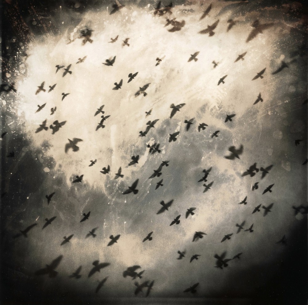
Every year Rayko hold a competition for photographs taken with basic plastic cameras (https://www.lensculture.com/articles/rayko-the-best-from-photographers-with-plastic-cameras-and-film). The entries have an unsurprisingly low-fi feel which brings a consistent appeal to the entries. The photographer would have had to leave a lot to chance, unsure of what the resulting photograph would be and unable to apply changes in the processing stage - this is clearly part of the appeal. It gives the photographs a magical and fundamental quality, an originality which would be lacking if we knew that the work was digitally manipulated.

I've been attracted to the idea of doing some "lomo" photography for a while, but worried that it was too gimmicky and the seeming offer of high integrity was itself false. However, this work inspires me that it would be worth taking a more lo-fi approach and leaving part of the outcome to chance.


Martin Bogren

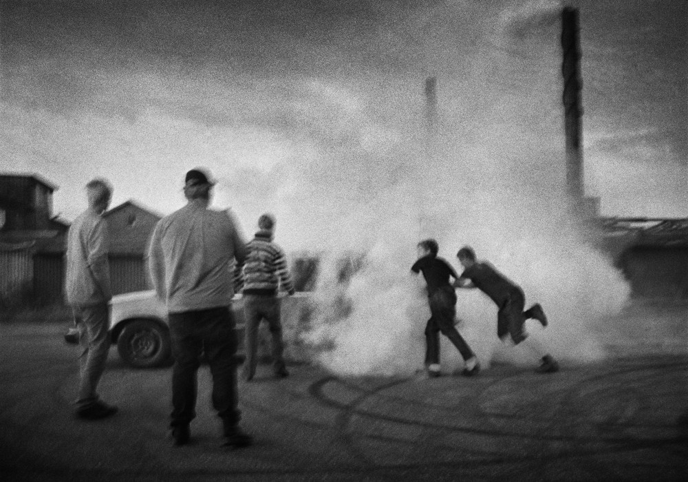
I've seen Bogren's series "Tractor Boys" previously, possibly in British Journal of Photography, I was intrigued but I didn't comment in the blog because I just put the work into the category of reportage which didn't really interest me. However, I now see the work in a different light and I'm more aware of why I find the work intriguing (https://www.lensculture.com/articles/martin-bogren-tractor-boys).

The subject matter is that of young men in Sweden who spend their time racing their cars against each other. However, the work has more drama and character than would normally be found in documentary photography. The photographer is adding an additional layer of artistic interpretation here and it is in the combination of the interest of the subject and how this is used and built upon by the artist that the unique character of these photographs is derived.

There is a narrative here, which at least in part is derived by the contrast (juxtaposition), of the raw and macho nature of the subject and the sensitive and poetic nature of the resulting photographs.


Shigeru Yoshida

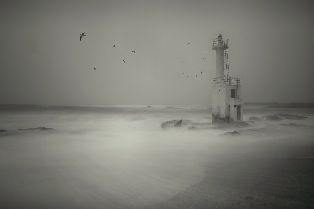
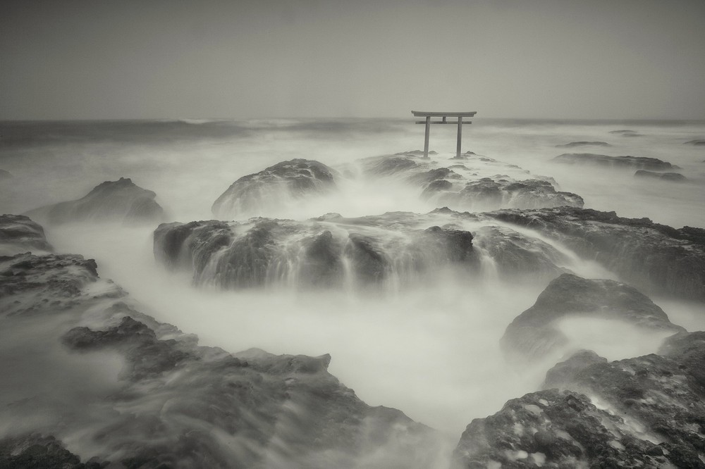
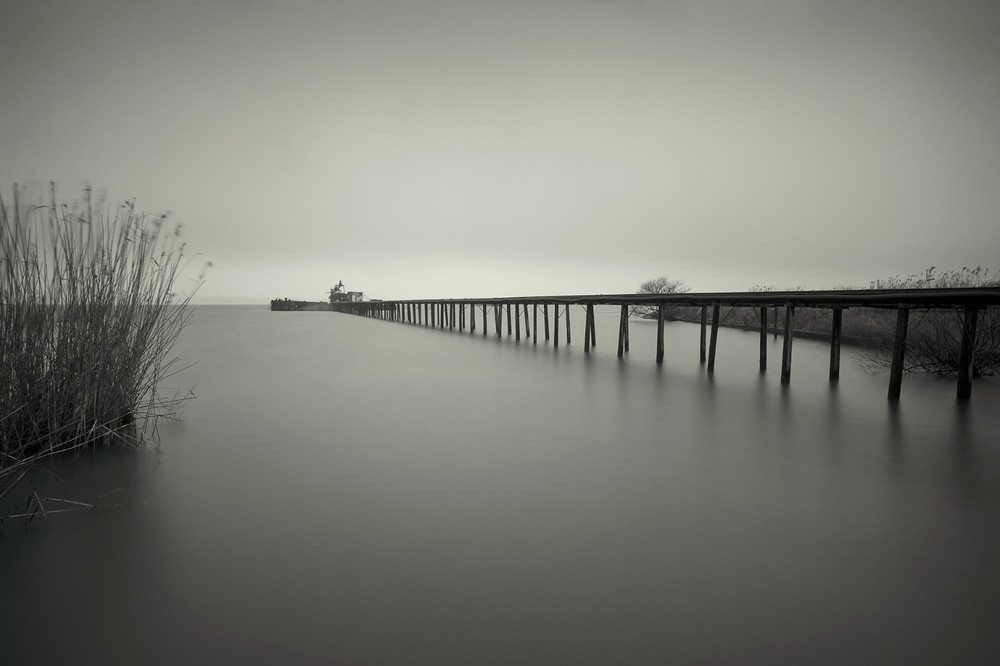
More inspirational work on Lens Culture - https://www.lensculture.com/articles/shigeru-yoshida-border . At first glance I mistook the work of Shigeru Yoshida as being little more than the long exposure beach shots that appear frequently on Flickr and which I attempted to take myself until I started this course. However, in practice this work has a subtlety to it that far surpasses the gaudy Flickr counterparts.

I think it's the subdued and delicate tones which makes the images so interesting. Levels of contrast are very low and the compositions are simple and understated.


Monday, 16 December 2013

Frank Hallam Day

I'm increasingly finding Lens Culture (www.lensculture.com) to be an excellent means of finding interesting and inspirational photographic work. The photographers included seem to be creating imaginative, original and artistically interesting work.

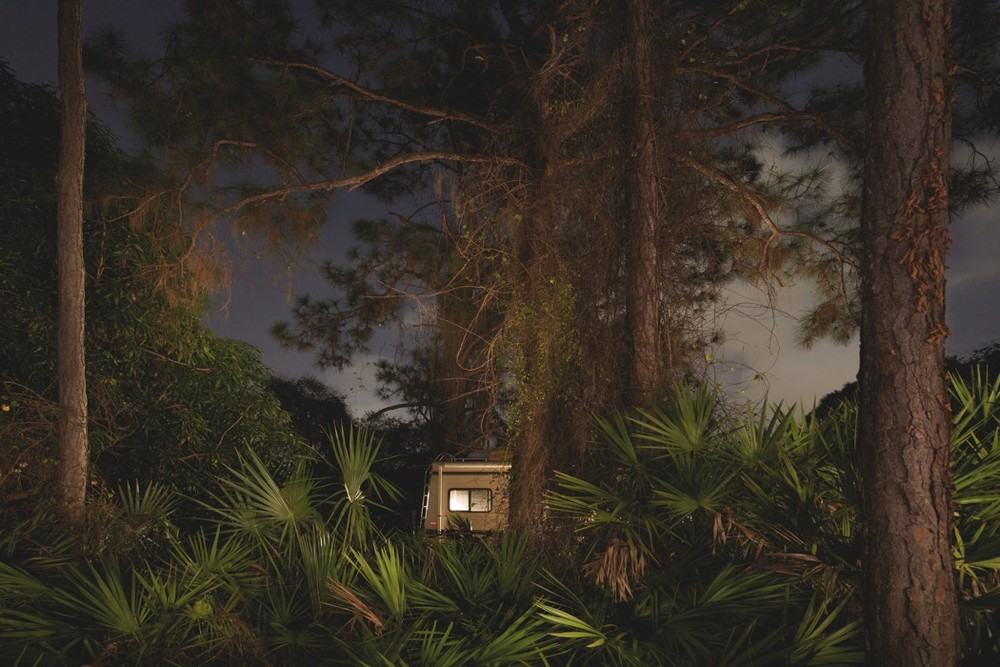
Frank Hallam Day's series "Nocturnal" (https://www.lensculture.com/articles/frank-hallam-day-nocturnal) was shot in Florida and consists of night shots of various motorhomes parked up in the countryside. The photos are unposed and taken without the awareness of the inhabitants. There is staged feeling to the work which I think comes from the light which emanates from the caravans - it creates a quite a unique atmosphere. There is an element of the voyeuristic here, but also of the hunter - the motorhomes are hidden within the foliage and look almost like hiding animals.

The work raises questions about man's relationship within nature, particularly in terms of how we to choose to enjoy it, but on our terms.


Magnum (narrative)

Not surprisingly, many of the photographs in the Magnum Millenium book I recd are relevant to considerations of Narrative. Here are some more comments on some of my preferred shots.

Many of the photographs in the book make a beautiful image out of a horrific subject. 2 good examples of this are Erich Hartmann's photo of a dissection table in a concentration camp (pg 179) and Paul Lowe's image of footsteps in blood soaked snow in Chechnya. Both photographs have an aesthetic beauty born of their use of shape and tone, which both transforms and are transformed by the realisation of what they portray.

In other photographs we are presented with images which are open to multiple interpretations. These images play with and challenge our preconceptions, prejudices and social views. As an example Patrick Zachmann's image from Jerusalem (pg 240), raises far more questions that it answers.

Juxtaposition is often an aspect of photographs which tell stories. Harry Gruyeart's image of a desert taken from inside a taxi juxtaposes the traditions and bright barren opennness of the desert with the dark, cramped nature of the taxi (pg 227). Via the extreme perspective in Guy le Querrec's image of a Native American on horseback the man is made to look extremely small and quite absurd (pg 460). Another image which has juxtaposition by including a number subjects which don't seem to fit with each other is Abbas' image of a hekmatyar fighter guarding access to kabul. The fighter is sat on a bed in a middle of a barren scene, he looks bizarrely out of place with his machine gun. His bemused, stilted expression and mannerism just adds to the surreal (pg 525).

I guess another example here would be Martin Parr's photo of a tourist on the back of a pony on holiday in Turkey - filming the view on his camcorder (pg 529). In this instance, the components of the photograph not only raise questions but also amuse us.

Starting Part 5

I'm now pleased to be starting Part 5, I've read through the course notes for this Part already and even started thinking about subjects for the Assignment. I think there would be a tendency for this Part to lean toward Reportage photography, but as I've said previously, this style of photography doesn't inspire me greatly. However, I think an interest in narrative could also lead to Tableau - I'll be trying to lead my exercises and considerations in that direction.

I'm intending on finishing this Part fairly quickly, but then again I always say that....

Sunday, 15 December 2013

Magnum (lighting)

A few images which show an interesting use of light in the Magnum book I got for my birthday.

Harry Gruyaert's photograph from inside a room in Mali. The scene has high contrast with the bright light outside showing through the window in the scene outside and also the light shining through from the window to the side (pg 296). The image has wonderful warm tones.

The sunlight through the shutters create a myriad of patterns in Gueorgui Pinkhassov's image of Japanese business men. Combined with the out of focus shapes of the men, the image takes on a beautiful abstract quality (pg 387).

The backlighting in the image of the forest canopy in Stuart Franklin's photograph creates a wonderful silhouette pattern of pure black and white (pg 508).

I was suprised to see that Bruce Gilden was part of Magnum. His approach to photography which subjugates and almost humiliates the subject seems quite counter to the humanitarian ethic of Magnum - at least in terms of approach, if not output. However, the results are powerful, striking and unique. The literally "in-your-face" flash bleaches out and freezes the subject and leaves the background darkened and blurred. The expressions on the faces of the subjects range from the shocked, to the confused, to the defiant. (pg 484).

Assignment 4 - conclusion

I've now submitted Assignment 4 to my tutor, I've captured my reflections within the submission, so I won't add much more here other than 2 say that I enjoyed Part 4 and I'm looking forward to completing Part 5 and then moving on to the next course!

My full submission for Assignment 4 can be downloaded here - https://dl.dropboxusercontent.com/u/104013160/Assignment%204%20-%20Steven%20Briggs%20-%20510812.zip

Tuesday, 19 November 2013

Bas Princens

Bas Princen's work is very intriguing (http://www.oftheafternoon.com/bas-princens-images-of-vast-structures-and-spaces/). His photography captures the interplay of the natrual andman-made environment with a centre point of buildings and the construction and destruction process of buildings. There is something fantastical about the images, but also very matter of fact. In truth, i'm unclear as to whether the images contain any manipulation of reality or just a very specific perspective of it. Size, scale and even time and place are often difficult to grasp here. The images often have a flatness as a result of little, or at least very constrained/restrained shadow - I think this increases the sense of dislocation from context and place.

There is something of the Dusseldorf school here, but also something more playful.

20130808-113251.jpg

20130808-113300.jpg

20130808-113318.jpg

20130808-113329.jpg

Alex Prager

I bought the November 2013 copy of British Journal of Photography at the weekend. Probably the most interesting work (to my current taste), was by Alex Prager. Prager's work is highly stylized, cinematic and reminiscent of 50's Amerciana. Some (but not all) of the work is of a grand production scale, costumes are carefully chosen, people in the work are considered characters, lighting is very deliberate, perspective, focus and composition are highly controlled. There is an element of humour, but also a under the skin darkness and anomie. Overall the images are exquisite to look at.


Thursday, 14 November 2013

Ruben Brulat

Robin Brulat takes photographs of the natural and man-made environment in which he situates himself, naked, small and almost hidden in the frame (http://www.oftheafternoon.com/self-portraits-from-ruben-brulat/). I think this interests him as a way of engaging and representing engagement with nature.

The images have a not quite instant appeal. At first when you see them they look like, distant, cool almost inhuman landscapes and cityscapes, and then you see a naked body and your head spins for a second as the image takes on new layers of significance and meaning.

The images have a stillness to them. The perspective is also quite flattened. The lighting is also quite straight on, though often other lightsources exist within the frame also.

20130801-114810.jpg

20130801-114757.jpg

20130801-114815.jpg

Sunday, 10 November 2013

Exercises, Learning and Technology

As I approach the end of this part of the course I was re-reading the course notes and looking through some of the exercises I've done on light.

I'm aware that I've rushed some of the exercises and even skipped certain sections of them. In each case I did this where I felt that I got nothing more to learn by doing the exercise. I genuinely don't mean this in an arrogant way, it's just that I feel that I know what I need to know about ISO settings and the effects of increasing/decreasing exposure.

Having said that I was struck when re-reading the course notes that I probably still don't make a conscious decision (in the way proposed in the notest), re exposure or white balance settings. However, when shooting RAW I know that I can comfortably alter these settings after on the computer. But this of course raises the question of whether this is lazy/cheating/ignorant etc. And also whether by not potentially having the experience in doing things fully manually in a fully committed way the photography will in some way be inferior.

I learnt a lot of my skills as a photographer shooting 35mm film in an SLR about 30 years ago. However, it's significantly easier to experiment, practice and therefore learn and understand in a digital environment. What I mean by this is that previously, when shooting film I understood that tungsten lighting would produce a horrible orange cast over my photos unless I used a blue filter or special film. However, my options here were very limited and if I got those options wrong, I couldn't correct anything. This meant that my creative options were actually very limited. And unless I had a lot of equipment, a lot of time and a lot of film - so in other words I had a lot of money and/or was a professional photographer - I would be very limited in terms of what I could achieve. I could take great photos, but my subject matter would be significantly more limited to what I could do now. So what I concluded here was that the technology was enabling me to be more creative by giving me more options (consistently through time), but that a clear eye as to how to remove the orange colour cast of tungsten lighting (for example), was still very important. In fact the creative aspect of this is even more open because I can do far more than stick a blue filter on the front of my lens and hope for the best.

I also reflected on how artists in DaVinci's time would learn their trade by sourcing materials for and mixing paints. No-one would really recommend an oil painter these days to mix their own paints. But that's not to say that an understanding of how light passes through paints of varying consistencies would be useful.

I guess my point is that I'm comfortable that as long as I have a base, core understanding of white balance (as an example), I'm OK not knowing individual Kelvin values of each light source because advances in technology mean I don't need to. I just need to have the creative eye to know when the white balance needs changing, and how to go about changing it, in order to achieve my required effect.

Saturday, 9 November 2013

Noemie Goudal

And here's another artist who plays around with the photographic frame... Noemie Goudal (http://www.oftheafternoon.com/noemie-goudals-installation-photographs/). Where Goudal differs is that he/she puts the photograph itself into the scene and then rephotographs that as an installation. The original photograph transforms the scene and inturn the final photograph.

island2

haven2

thelovers8

In honesty, in my view the idea here is better than the resulting photograph. However, the installations are probably far more impressive.